
Understanding and applying usability heuristics, is important for designing products that provide your users with enjoyable experiences. Usability guidelines, or ‘heuristics,’ are used for measuring the usability of an existing product and when creating new designs. Employing heuristics enable development teams to deliver products that are easier and more efficient to use and meet user expectations, which results in less user frustration and mistrust in your product.
Sometimes referred to as rules of thumb, heuristics can help teams find solutions to design problems. Usability heuristics are based on user research, observation of user behavior, trial and error, and the sum of user experiences in common scenarios. In web and application design and development, heuristics are used to normalize user interaction design in order to match user expectations. In the summer of 1994, Jakob Nielsen and Rolf Molich ushered in 10 Usability Heuristics for User Interface Design. Since then, these guidelines have been used as the foundation for heuristic evaluations. Heuristic evaluations are assessments of the usability of a user interface by a trained usability expert. Over the last quarter century, many industry leaders and organizations have expanded and broken down these heuristics into finer detail to address evolving conventions for how design elements should respond when activated, what controls should looks like, what should happen when users make mistakes, and how to help users recover – all with the goal of meeting user expectations and providing pleasant user experiences.
Below is a description of each of the 10 heuristics, plus Flexwind’s additional heuristic to address responsive design. Each description includes an example from some websites and applications we encounter in everyday life.
Visibility of System Status
The system should always keep users informed about what is going on, through appropriate feedback within reasonable time.
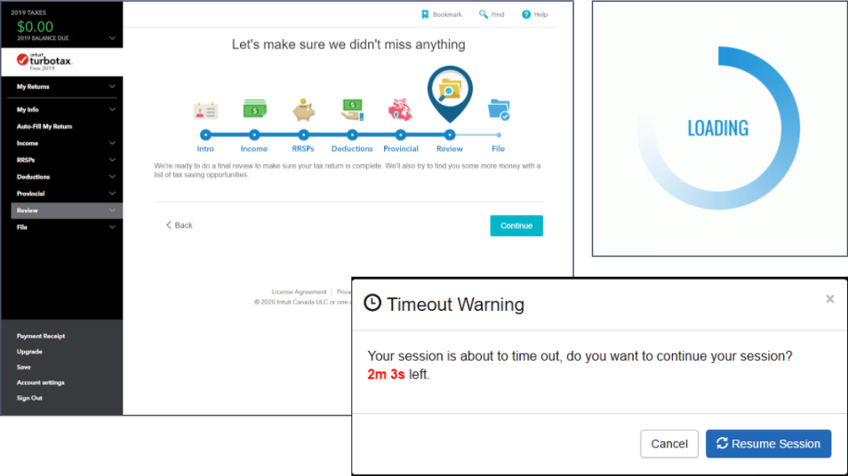
In the examples below, the user is informed of how things are related and what to expect. The navigation and process graphic for TurboTax (top left) shows how the sections are related to each other, the progress, and what’s next. It also establishes the navigation structure and page layout concepts. While pages are loading, users get feedback that something is happening (top right). Also, they provide users with an alert (bottom right) that a session time-out is about to happen.
Match between system and the real world
The system should speak the users’ language, with words, phrases and concepts familiar to the user, rather than system-oriented terms. Follow real-world conventions, making information appear in a natural and logical order.
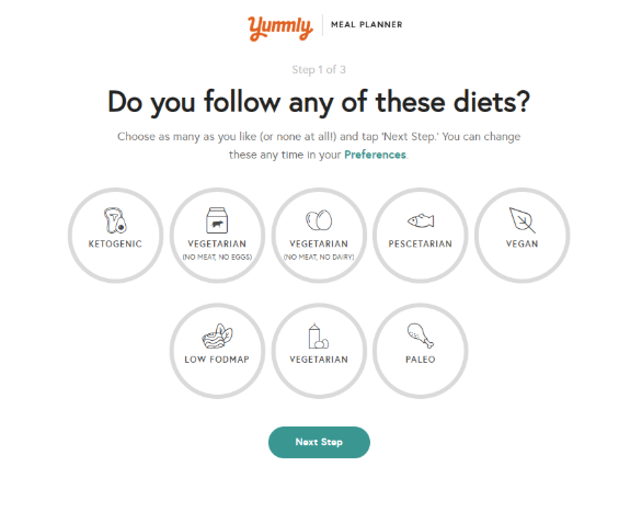
Yummly (below) does an effective job using icons that reflect their real-world equivalents and cooking terms that make sense to foodies of all levels.
User Control and Freedom
Users often choose system functions by mistake and will need a clearly marked “emergency exit” to leave the unwanted state without having to go through an extended dialogue. Support undo and redo.
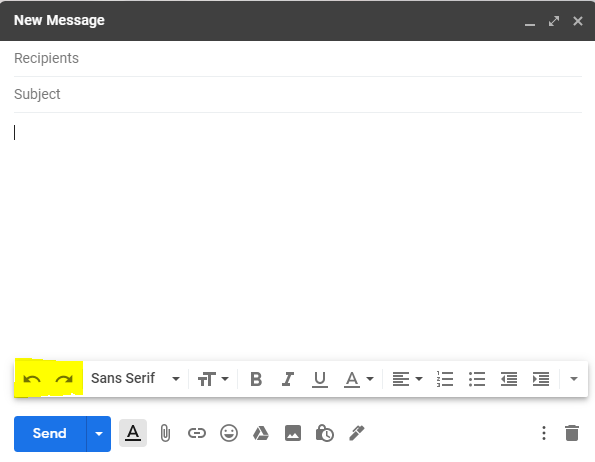
In the bottom left corner of the image below, Google Mail provides you the ability to undo and redo while typing an email message.
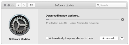
The software update window below, includes information about the time remaining for to complete the software update and supports your ability to stop the update by clicking the “x” button to the right.
Consistency and Standards
Users should not have to wonder whether different words, situations, or actions mean the same thing. Follow platform conventions.
Google (below) uses conventional menu items in its online applications. These menu labels and icons follow patterns of other competing and similar applications to lessen the user’s need to learn something new.
Error Prevention
Even better than good error messages is a careful design which prevents a problem from occurring in the first place. Either eliminate error-prone conditions or check for them and present users with a confirmation option before they commit to the action.
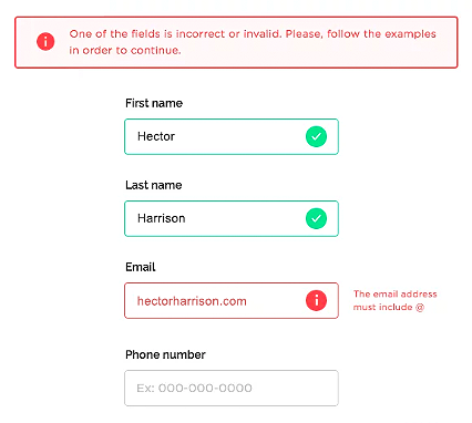
Here, Google anticipates potential errors before they happen. In the example below, an inline error message informs the user that the @ symbol is missing from the email address, before the user continues to the next field, in this case Phone number.
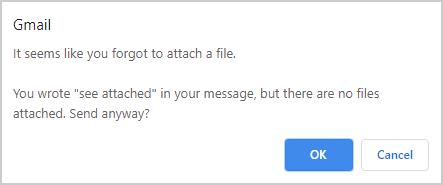
When attempting to send an email, the designers and developers at Google (image below) implemented smart logic to recognize and prevent a potential user oversight by informing the user that they typed “see attached”, but did not add an attachment to the email.
Below, Twitter reminds their users how many characters they have left in a tweet. When a user goes over the character limit, they are allowed to continue typing their thoughts, but the overflow text is highlighted as they continue to type the message.

Flexibility and efficiency of use
Accelerators — unseen by the novice user — may often speed up the interaction for the expert user such that the system can cater to both inexperienced and experienced users. Allow users to tailor frequent actions.
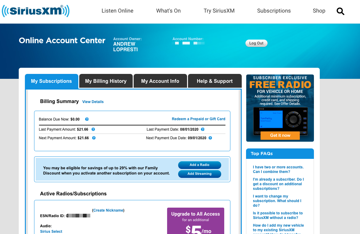
In the example below, SiriusXM displays the following upon a successful login:
- Billing summary and recent history
- Suggestion upgrading to “All Access”
- Suggestion to Add a Radio and Add Streaming
- Redeem a gift card
- Active Radios/Subscriptions
- Top FAQs
- Help chat feature
They provide content tailored to the specific user, allowing them to quickly find what they are most likely looking for and discover other content they otherwise would not have been aware of. They also provide easy access to assistance through FAQs and a chat feature for those who may need help.
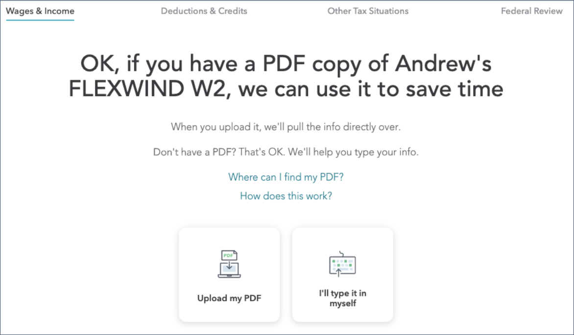
In the image below, TurboTax includes an accelerator for more experienced users to upload a PDF of a W2 form, while also supporting less technically savvy users by allowing them to manually input their information. The design approach accommodates both types of users.
Recognition rather than recall
Minimize the user’s memory load by making objects, actions, and options visible. The user should not have to remember information from one part of the dialogue to another. Instructions for use of the system should be visible or easily retrievable whenever appropriate.
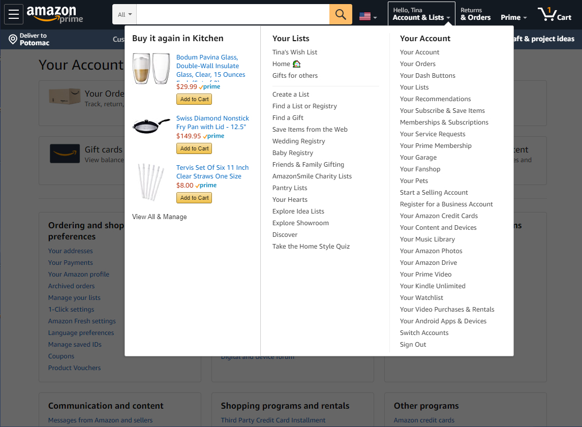
Amazon (below) displays previously-purchased items where and when you’re likely to need them. When you go to Accounts & Lists, expecting to scour through your order history, you’re greeted with several of your recently purchased items with options to immediately “Add to Cart” or View All.
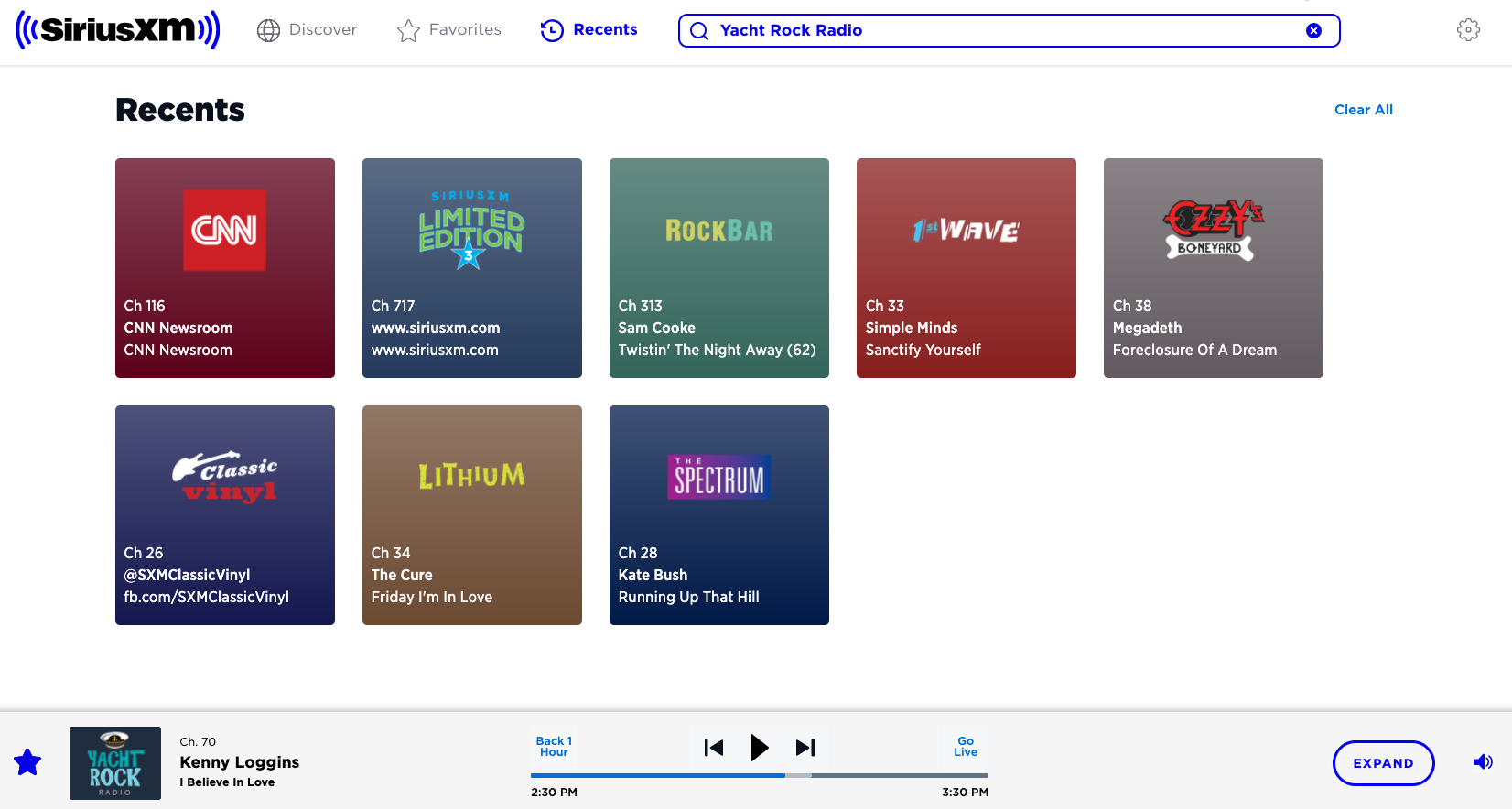
SiriusXM remembers the last station you played (Yacht Rock) so you can continue the experience from your last visit. Or, perhaps you want to listen to one of your other stations, well they’ve conveniently provided your recently played stations so you don’t have to search.
Aesthetic and minimalist design
Dialogues should not contain information which is irrelevant or rarely needed. Every extra unit of information in a dialogue competes with the relevant units of information and diminishes their relative visibility.
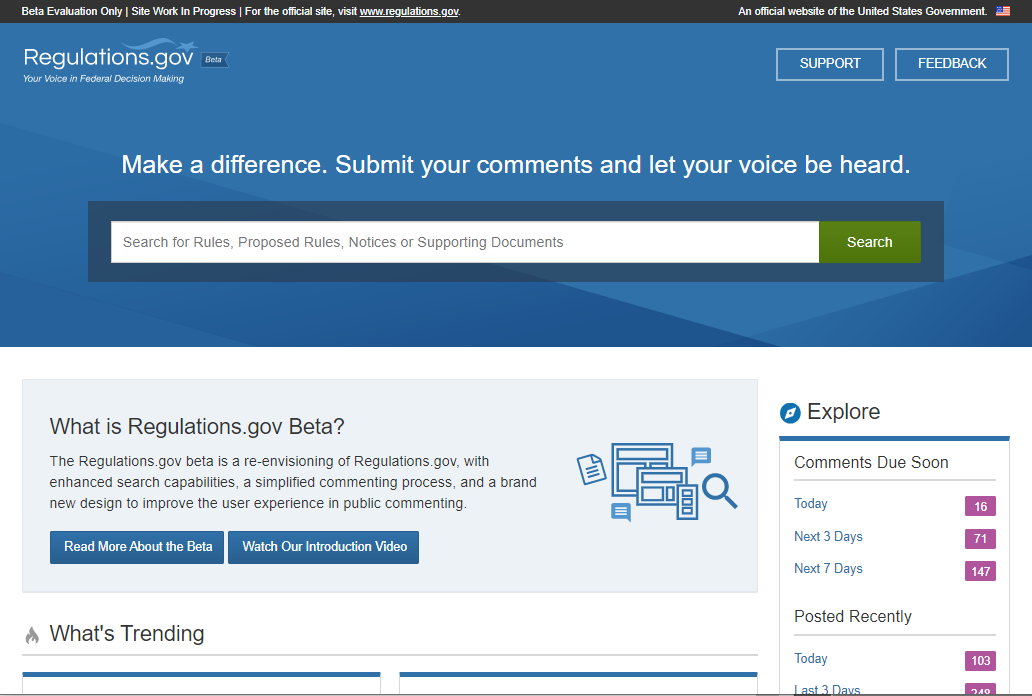
In the screenshot below, knowing you’re most likely to be on this site to find a specific regulation, Regulations.gov has provided a prominent and robust search box for you to find, read, and comment on federal government regulatory issues.
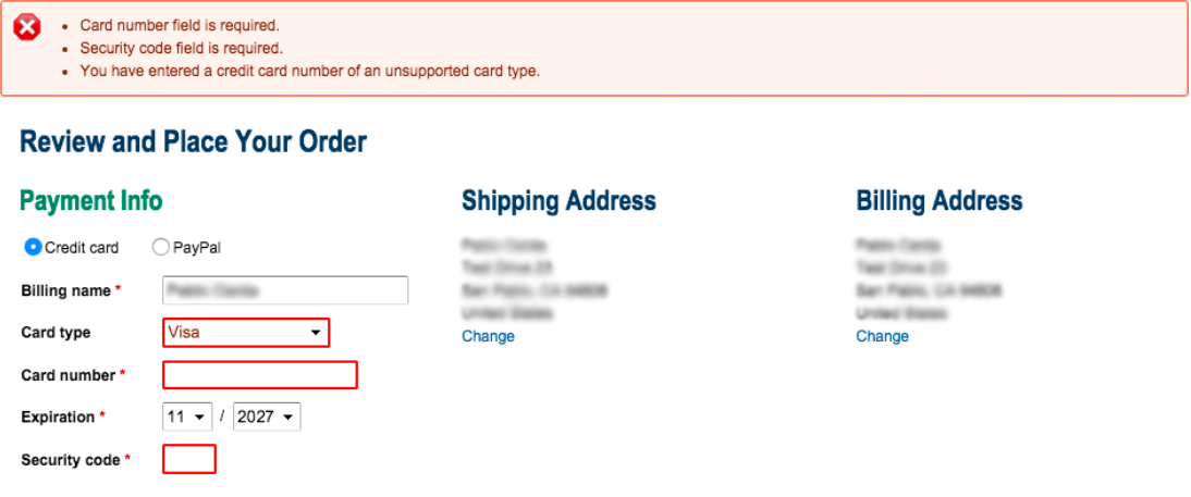
Help users recognize, diagnose, and recover from errors
Error messages should be expressed in plain language (no codes), precisely indicate the problem, and constructively suggest a solution.
In the image below, the shopping cart form provides alerts of what is wrong and what needs to be done to recover. The fields with errors are highlighted and itemized instructions are listed at the top of the page, void of error codes or technical jargon.
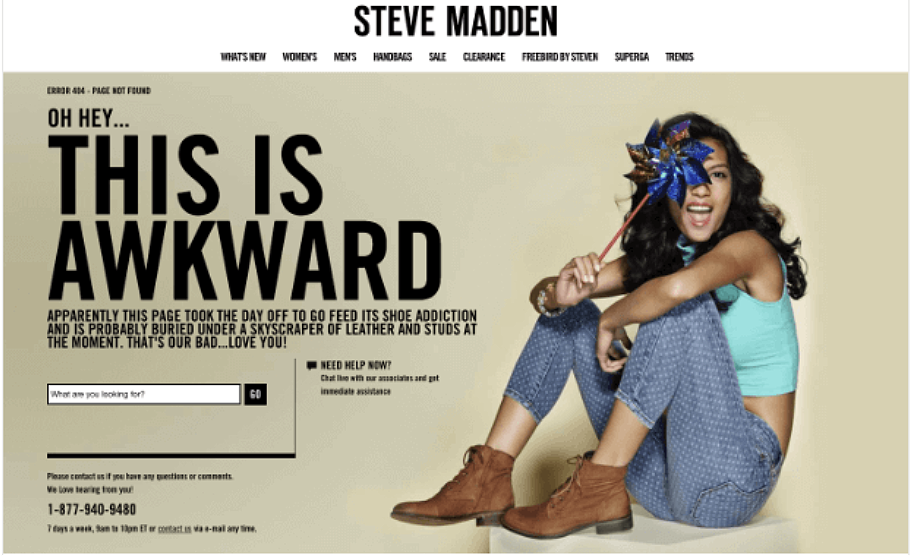
Help and documentation
Even though it is better if the system can be used without documentation, it may be necessary to provide help and documentation. Any such information should be easy to search, focused on the user’s task, list concrete steps to be carried out, and not be too large.
Online shoppers can easily bookmark an item that no longer exists which can result in a broken link. Steve Madden has fun with it’s “page not found” error page, the notorious 404 error. They playfully pokes fun at themselves for the error, since is not a good idea to make the you feel dumb. Plus, a search box is included so you can try your search again directly from the error page. And, there is a chat function and a phone number to call them.
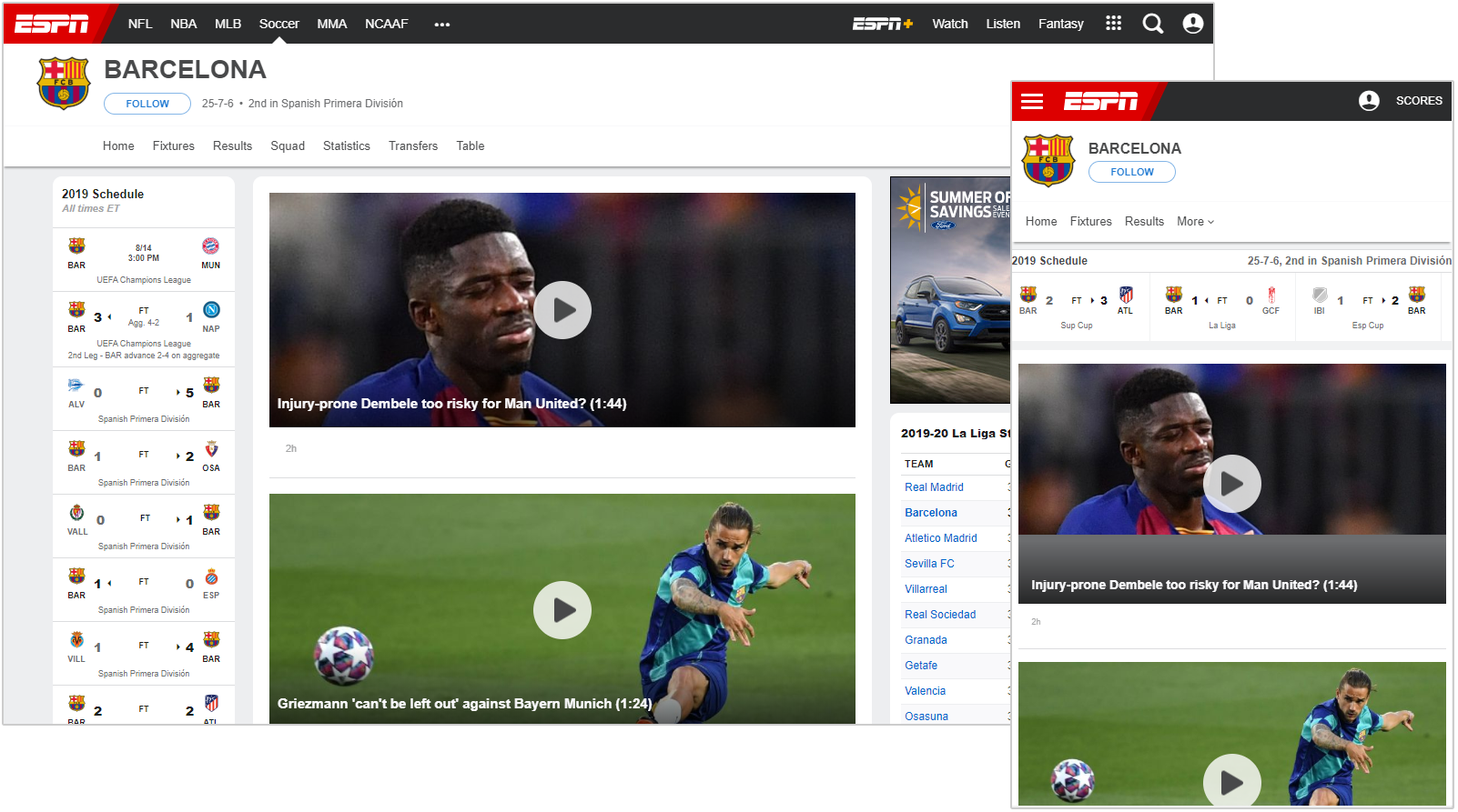
Support use across various devices – Flexwind’s heuristic
Online content should be usable across various screen sizes and orientations. Rearrange, resize, and remove content to ensure the system supports user tasks regardless of screen resolution or size.
In the example below, ESPN created a seamless experience from your desktop to your tablet or smartphone. Since ESPN’s last redesign in 2015, nothing has impacted user habits more than the advances in bandwidth and smartphone usage. In January of 2020, ESPN had 94 million site visitors, and 61 percent accessed their site only on a mobile device. So ESPN pivoted to a “mobile first” stance on website design.
Allow Flexwind to measure the usability of your product
Flexwind uses a combination of heuristics defined by Nielsen and Molich, sub-heuristics defined by Xerox, and our own heuristics for responsive design. Our UX professionals will conduct a heuristic evaluation of your interface and information architecture to identify what aligns with the heuristics, what does not, and provide actionable steps to help you deliver a better user experience. We can test websites, applications, mobile apps, wireframes, mockups and even paper sketches.
As outside experts, we deliver unbiased recommendations based on what’s best for your users and your business. Get in touch and let’s work together to ensure your product is easier and more efficient to use, matches your users’ expectations, and provides an enjoyable experience.
About the Author
Andrew Lopresti, UX Evangelist
Andrew joined Flexwind in 2019 after building and leading UX teams at multiple, prominent Federal consultancies. Andrew seeks to understand why smart people sometimes fail and looks to turn those frowns upside down. A frequent speaker at conferences and guest lecturer at local universities, Andrew holds a Bachelor’s degree in Studio Art (from when the internet was young) and has a UX Certification from Human Factors International.